Have you been in this situation? The team stays up late designing a beautiful, professional BI dashboard and launches it full of hope, only for almost nobody to open it again three months later. The report is complete and has every metric, but it simply “isn’t used”.
According to statistics, although many companies implement BI, actual adoption often stalls at around 25%. The problem is usually not whether the tool is easy to use, but the design thinking. If you design reports the way you would manage ecommerce products, you’ll find that dashboards also need positioning, audience segmentation and experience design.
Why does your dashboard end up as “decoration”?
-
A jumble of every metric, with no decision focus: many people assume that more metrics look more professional. But if a report doesn’t answer the core question, it’s just a pile of numbers. For example, the marketing team only wants to know ROI, but you give them page after page of technical events and page load times. The key points get buried, and users naturally give up.
-
It doesn’t fit daily routines, so it costs too much to use: if opening the report is more hassle than opening Excel, users will never buy into it. Reports need to be built into “decision points”, such as weekly meetings and daily operations reviews.
-
No storyline, so the numbers don’t speak: a genuinely useful dashboard needs to “guide judgement”. Is the target being met? Is something abnormal? Is action needed? Without trend comparisons and a visual focus, users are left with more questions than they started with.
Get the report’s positioning right: strategic vs. operational
Before designing a Data Studio report, ask yourself: who is this report for?
| Dimension | Strategic dashboard | Operational dashboard |
|---|---|---|
| Time range | Month / quarter / year (long-term trends) | Day / week (short-term tracking) |
| Main users | CEO / senior executives / VPs | Department heads / frontline teams |
| Core question | “Are we heading in the right direction?” | “Are operations running normally right now?” |
| Example KPIs | ROI, annual growth rate, market share | Real-time orders, traffic, stock levels |
| Visual focus | Achievement rate, year-on-year and period-on-period comparisons | Real-time figures, anomaly warning lights |
3. Ecommerce thinking: four analysis dimensions
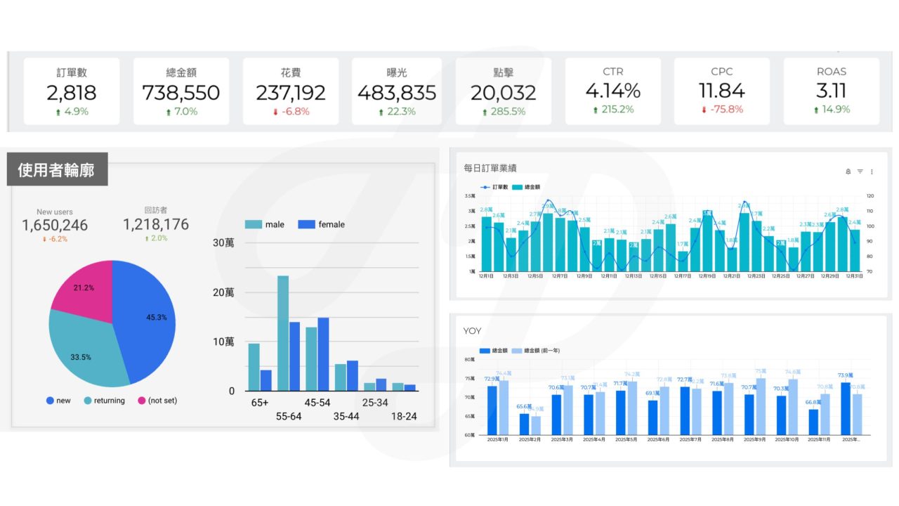
Taking ecommerce operations as an example, a report people actually use should be built around these four core sections:
1. User profile (who): who is buying?
-
Focus: age, gender, region, device type, ratio of new to returning customers.
-
Recommended charts: pie charts, geo maps.
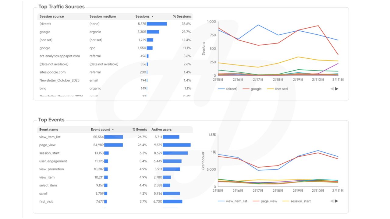
2. Traffic acquisition (where): where does traffic come from?
-
Focus: organic search vs. paid sources, conversion rate (CVR) by campaign, ROI by channel.
-
Recommended chart: stacked bar chart.
3. Behaviour analysis (what): what are users doing?
-
Focus: popular product pages, average time on site, key event interactions.
-
Recommended chart: table with heatmap formatting.
4. Business conversion (value): how much do we make in the end?
-
Focus: ecommerce revenue, number of purchases, average order value (AOV).
-
Recommended charts: trend charts, large KPI scorecards.
💡 Expert tip: watch the GA4 scope. Use session-scoped dimensions to analyse traffic sources, and first user dimensions only when analysing member attributes.
4. Practical Data Studio design tips
-
Clear sections in the layout: divide the report into four quadrants to follow how people naturally scan a page.
-
Add interactive controls: always include a date range control and a channel filter drop-down. Making the report something people “use” rather than just “look at” is key to increasing adoption.
From “looking at data” to “making decisions”
Reports shouldn’t just display numbers. They should be your decision-making navigator. A successful Data Studio dashboard must target business questions and fit into workflows.
Next time: we’ll share how to bring cost and gross margin data from Google Sheets into your dashboard, upgrading it from simple “traffic analysis” to a powerful tool for operational decisions.
If you’re not sure how to take the first step, contact CloudAD to book an expert diagnosis, and let our data team run a full GA4 health check to help you turn data noise into a steady source of revenue.
Learn about the GA4 health check
Quick answers: frequently asked questions about Data Studio
Q1: Is Data Studio completely free?
Yes. Anyone with a Google account can use it for free. Note, however, that connecting non-Google data sources such as Meta (Facebook/Instagram) ads or LINE usually requires buying a third-party connector (such as Supermetrics).
You can also read our next article to learn how to bring in external data for free through Google Sheets.
Q2: Why don’t the numbers in Data Studio match the GA4 interface?
This is normal. There are three main reasons:
- Sampling: with large volumes of data, GA4’s calculation logic may differ slightly from BI tools.
- Differences in attribution models: the two may have a time lag in how they attribute conversions.
- Data latency: GA4 data usually has a processing delay of 24–48 hours. We recommend using Data Studio to watch long-term trends rather than worrying about small differences in a single number.
Q3: Do you need a programming background to build dashboards?
Not at all. Data Studio’s interface is very intuitive and uses drag and drop. If you understand basic Excel logic (such as sums and averages), you’ll pick it up easily.
Q4: Are there any quick-start resources for beginners?
If you want to build your first report from scratch quickly, we recommend:
- Google’s official tutorial: Data Studio quick start guide
- Professional consulting: if your company has more complex tracking or cross-channel integration needs, ask about CloudAD‘s Data Health Check, where a Google certified partner can help you connect your data end to end.