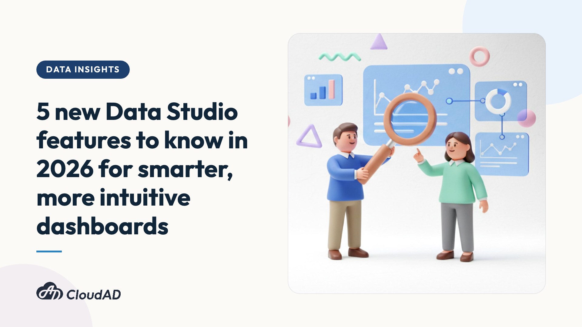
With the arrival of early 2026, Google Data Studio released a series of core updates that improve user experience and automation. These features make building reports more flexible and greatly improve the efficiency of team collaboration. CloudAD has picked out 5 highlight updates you won’t want to miss.
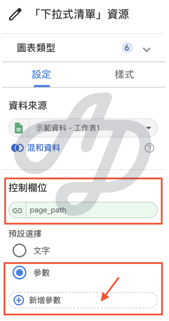
1. Filter controls now support parameter default values
In the past, when setting up filters, the default value was usually fixed. Now default values can accept parameters. This means filter conditions can change dynamically, without having to go into each filter control and set a fixed value manually.
- Use case: for marketers who need to track a different campaign page each month, you now only need to create a “campaign path” parameter and set it as the filter’s default value. From then on, you update the parameter once a month at the data source, and the whole report updates with it. No more tedious adjusting of filters one by one.
- Core value: reports become much more personalised, and one report can meet a wide range of viewing needs.

2. Component-level links
You can now create a dedicated link for a specific component (such as a single chart or control), taking users straight to the key content.
- Use case: when communicating in Slack or email, the recipient clicks the link and lands directly on the key chart. Managers or clients can see the specified content in a second, without having to scroll through a long report.
- Core value: communication narrows from “the whole report” to “a single insight”, removing the time spent locating information and keeping data discussions more focused.

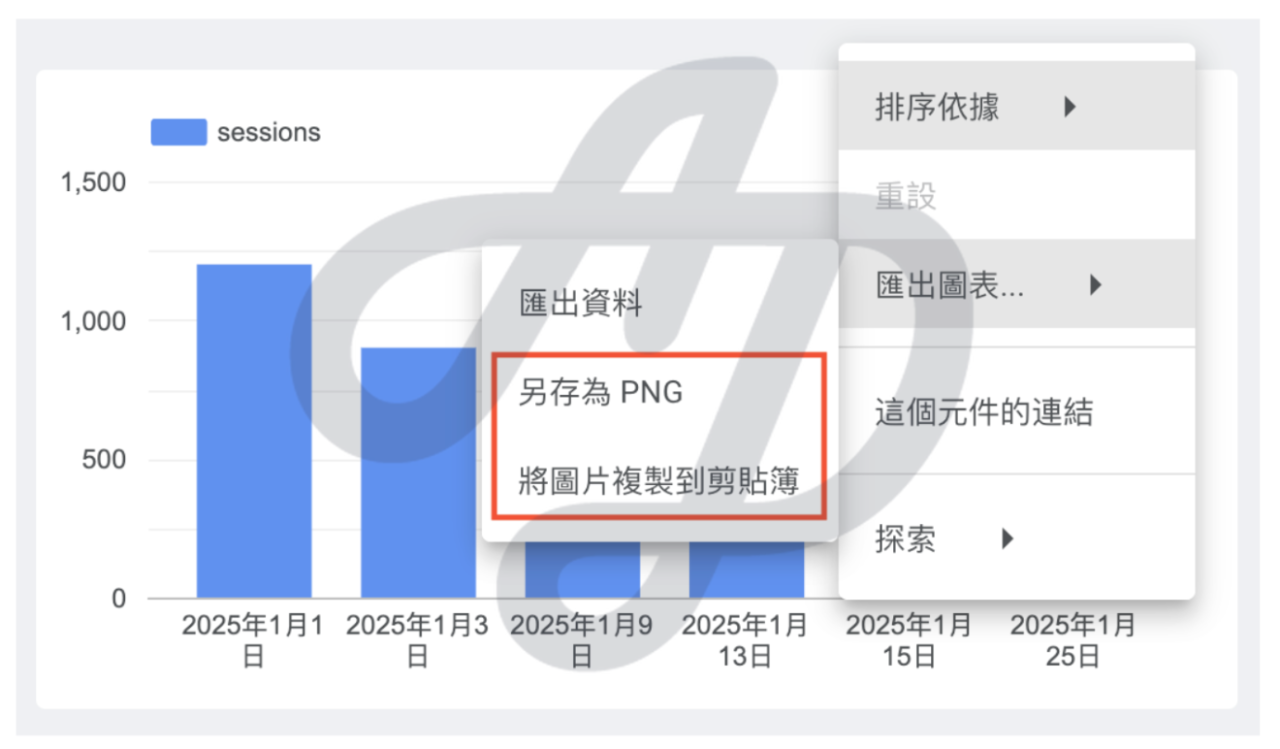
3. Export charts as PNG images
Previously, Data Studio charts could only be exported as PDF or CSV. When you needed a single chart, you often had to rely on manual screenshots, which easily led to poor resolution or distorted proportions. Now, exporting a single chart as a PNG is officially supported, and you can even “copy to clipboard” to paste it straight away.
- Use case: when building a presentation, you can copy and paste charts directly, with no more ugly screenshots. You can also give charts to Gemini or ChatGPT and use AI’s image recognition to quickly analyse trends, summarise key points or write conclusions, cutting an insight report that used to take an hour down to seconds.
- Core value: besides saving time on screenshots and layout, it breaks down the barrier between data and visuals, greatly improving how efficiently you get from “looking at the data” to “producing conclusions”.
4. Hourly scheduling for report delivery and alerts (Data Studio Pro only)
Moving from receiving reports or alerts “daily” to “hourly” marks the shift of data monitoring from “next-day settlement” to a “real-time war room”.
- Use case: during high-traffic periods such as major sales, monitor ad spend and ROAS every hour. If the system detects that budget is being spent abnormally fast, or the conversion rate suddenly drops to zero, hourly automatic alerts let you stop losses immediately and adjust your strategy quickly.
- Core value: it greatly shortens the gap between “when the data happens” and “when action is taken”, so data can genuinely “stay ahead of problems”.

5. Show or hide specific components by audience (Data Studio Pro only)
Report creators on the Pro version can now flexibly set whether individual charts, text blocks or controls are displayed, based on the user’s group. Report maintainers no longer need to keep several near-identical copies of a report for different audiences.
- Use case: frontline staff vs. senior management. Show detailed ad group data to frontline staff, and automatically hide the detail for senior managers, showing only a summary of core KPIs, so communication is precise and efficient.
- Core value: it greatly strengthens the security and flexibility of data sharing, and maximises the efficiency of report maintenance.

Conclusion
These five highlight updates show that Google Data Studio is rapidly evolving from traditional “static charts” into a “smart decision engine” with high interactivity, real-time alerts and precise permission controls. Whether it’s parameter settings that let a report “update in one place and sync everywhere”, or the hourly automatic monitoring exclusive to the Pro version, these features share one core goal: shortening the time from seeing the data to making the right decision.
However, no AI assistant, however powerful, and no hourly alert, however timely, can rescue “incorrect raw data”. Before you start using Data Studio’s new features, we recommend building the most solid possible foundation for your data.
Not sure whether your current data quality is up to standard? Get in touch and let CloudAD run a full health check on your GA4 to help you move smoothly into the era of AI marketing.