
Google Data Studio is a free and powerful data visualisation tool. It brings together data from many sources and presents it as interactive charts, tables, maps and more.
You don’t need any programming experience. With a simple drag-and-drop interface you can design professional dashboards, share them easily with others or edit them together, so everyone on the team can keep on top of the data.
This article walks you through building a dashboard in Data Studio and shares three example uses to help you get started.
Build your first dashboard in 3 steps
First, sign in to your Google account and go to the Data Studio website
https://lookerstudio.google.com/.
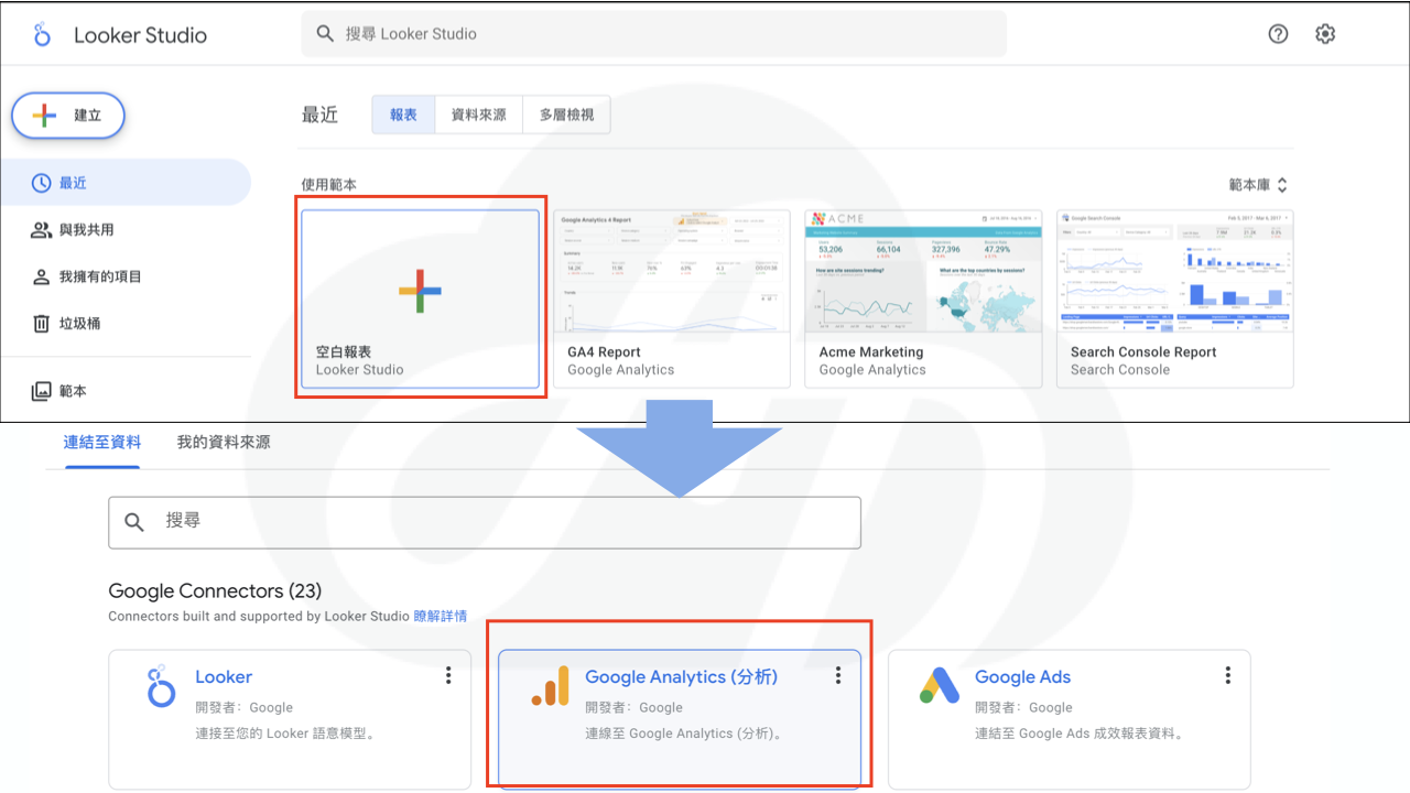
Step 1: Create a blank report and connect a data source
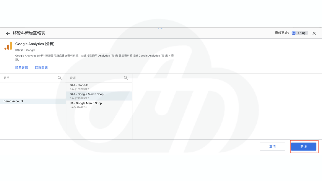
Click “Blank report”. Then, under data sources, choose the source you want to use, such as Google Analytics, Google Sheets or BigQuery. Here we use a GA4 data source as an example. When you click “Add”, Data Studio helpfully creates a table automatically, and you can start building visual elements.
Step 2: Add charts
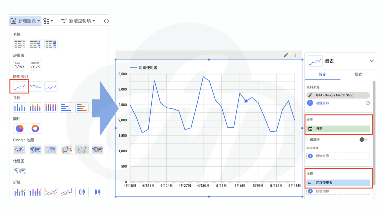
In the toolbar at the top, click “Add a chart” and choose the chart type you want, such as a line chart, bar chart, pie chart or pivot table. Once you have chosen a chart type, drag it to where you want it in the editing area, then select the appropriate dimensions and metrics. For example, to create an “Active users” line chart, click the chart you have just inserted and, in the panel on the right, choose “Date” as the dimension and “Active users” as the metric. Your chart is ready.
Once the chart is built, you can adjust it to suit your needs, for example by changing its colour, size or title. You can also add extra elements such as text notes and images.
Step 3: Share the report
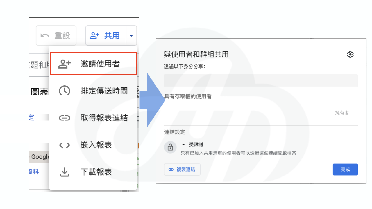
When you have finished, click the small triangle next to “Share” in the top right. You can download the report as a PDF or share it with others. You can share it publicly or privately with specific people. Once shared, others can view your dashboard via a link and even explore the data interactively.
Beyond the basics, Data Studio offers many more features. Filters let you narrow the data to what you need and analyse a specific range in more depth. Controls let viewers change how charts are displayed themselves, for example by date range or region. Annotations explain the data shown in a chart so it is easier to understand.
Data Studio example uses
1. GA4 data analysis
Using GA4 data, you can build a dashboard showing website traffic trends, user behaviour, conversion rates and more. Use line charts, bar charts, maps and other visual elements to show trends, and interactive filters so users can explore the data in more depth.
2. Google Ads performance analysis
By bringing Google Ads data into Data Studio, you can build a dashboard showing ad spend, ad performance, keyword performance and other metrics. Use tables, pie charts, line charts and other visual elements to show ad performance, and interactive filters to analyse how different campaigns and keywords perform.
3. Other data sources: Google Sheets
You can also put CRM, ERP and other data into Google Sheets and connect it to Data Studio. For example, you could build a dashboard showing sales, inventory, customer analysis and other metrics, with interactive filters to analyse data by product and customer.
Need more ideas? Visit the Data Studio template gallery.
Data Studio is a powerful data visualisation tool. It lets you build professional dashboards easily, so you can understand data better, communicate information and make informed decisions. Whether you are a data analyst, a marketer or simply want to understand your data better, visual dashboards help your data deliver more value. If you have any questions or needs, get in touch.